 Portuguese
  English
  Spanish
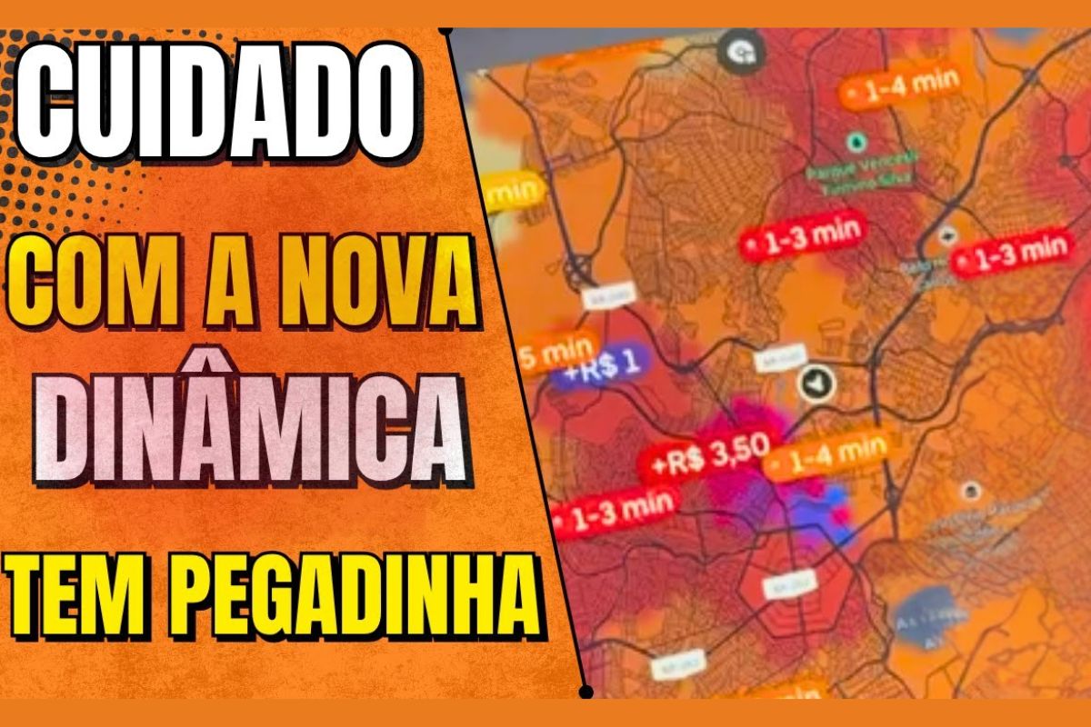
Uber’s New Dynamic Pricing Screen Reorganizes The Heat Map, Changes The Meaning Of Colors, And Highlights Purple As A Real Indicator Of Extra Earnings, While Yellow, Orange, And Red Signal Waiting Time And May Attract Drivers To The Same Areas, Creating A Herding Effect That Reduces Compensation And Raises Alerts About Impacts On Earnings Until 2026 With The Consolidation Of The Model
Uber’s new dynamic pricing screen changed the logic of reading the map and raised an alert among drivers. The key now is to accurately interpret what is demand and what is extra earnings, because the new dynamic pricing screen from Uber separates these two concepts. The colors yellow, orange, and red no longer signify dynamic fare and now indicate average waiting time for rides, while purple concentrates the true additional.
According to Ian Rocha, an experienced driver at UBER, the company claims that the goal is to facilitate map and demand visualization, with data that updates periodically. The practical risk is the hasty reading of the map’s heat, which can lead many drivers to the same point and collapse the dynamic pricing, reducing earnings in the short term and, if consolidated, affecting income strategies throughout 2026.
What Changes In Uber’s New Dynamic Pricing Screen
The demand colors have been reconfigured to represent estimated waiting: yellow indicates weaker regions, orange points to intermediate demand, and red suggests stronger points, with times ranging from up to 15 minutes in yellow, about 10 minutes in orange, and up to 5 minutes in red, according to examples observed in the app. These colors do not add a single cent to the fare and serve only to guide movement.
-
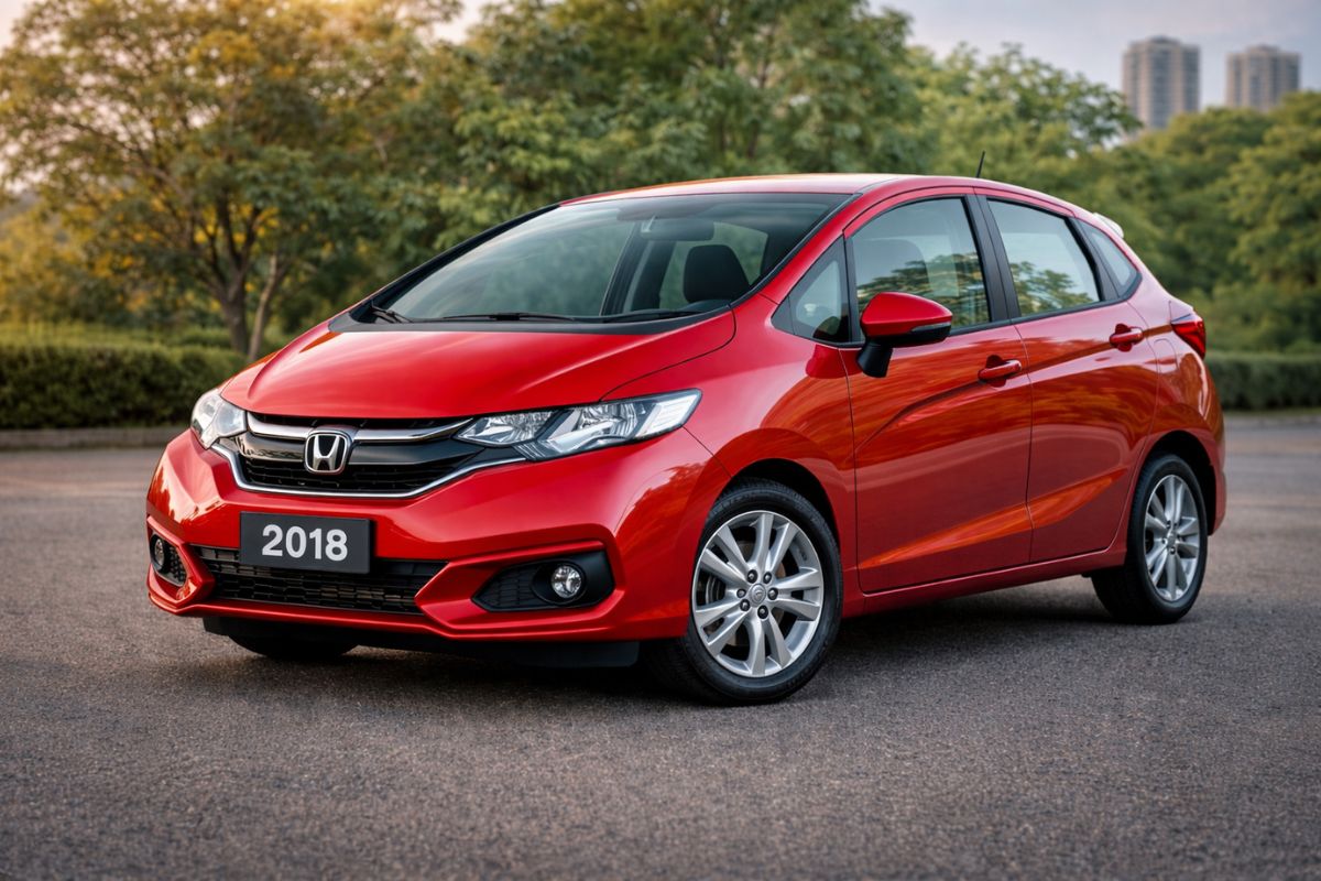
The Honda Fit has been discontinued for years, but the 2018 model is worth more today in the Fipe table than it cost brand new, proving that this used car, valued with a 1.5 i-VTEC engine and Magic Seat, only increases in price.
-
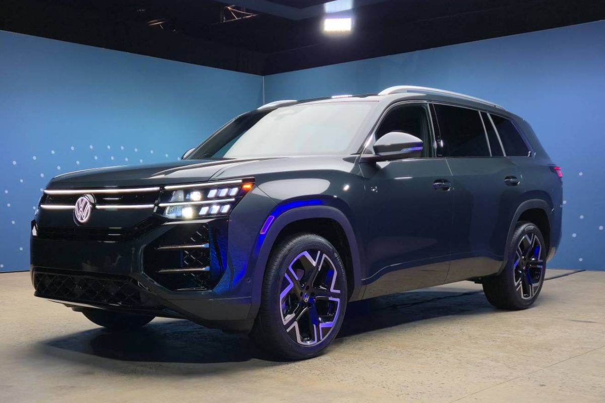
Volkswagen unveiled the 2027 Atlas with a 282-horsepower EA888 turbo engine, a 15-inch screen, massage seats, and a completely new interior to finally elevate the three-row SUV built on the MQB platform to a new level.
-
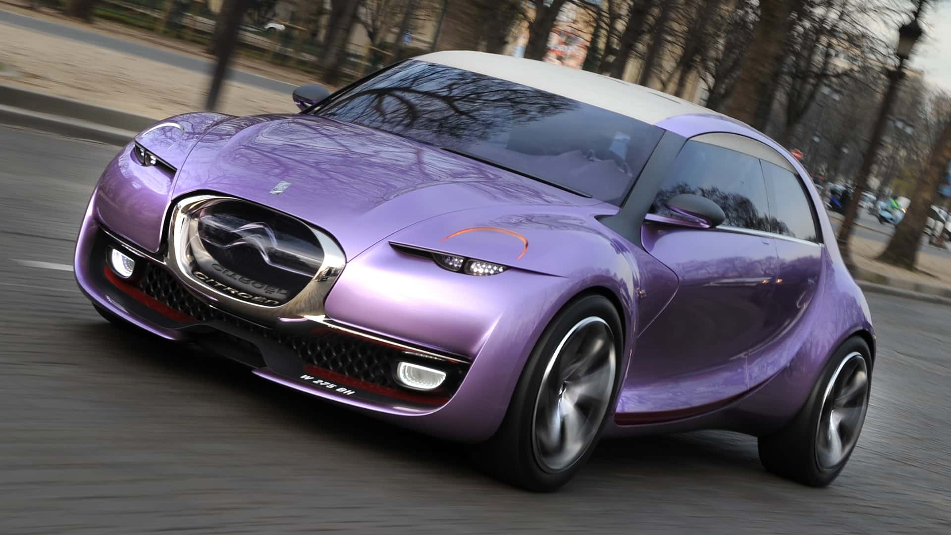
After decades out of the spotlight, Citroën is preparing to bring back the legendary 2CV as a low-cost electric vehicle, betting on the revival of one of the most popular cars in history and aiming to enter the race for affordable compact cars.
-
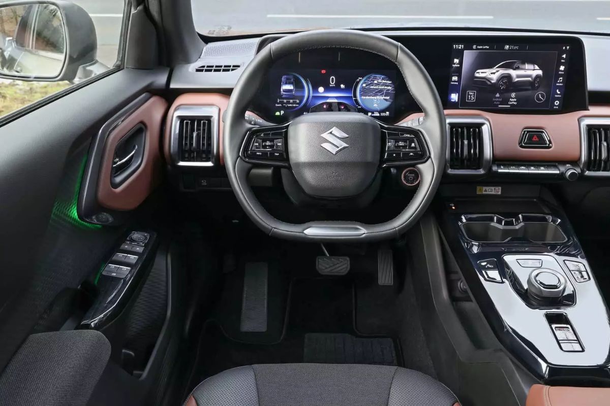
The 2026 electric Vitara arrives in Brazil and proves that Suzuki is not leaving: 4×4 traction, 184 hp, 61 kWh LFP battery, 293 km range, R$ 259,000, and a trunk capacity of 224 L.
The purple indicates extra earnings. When the area appears in purple, the ride in that region includes additional value. The app also allows navigation to highlighted areas, which helps in route planning. The correct reading is simple: yellow, orange, and red heat means higher chances of getting a ride quickly; dynamic is only in purple.
According to the explanation given to drivers, the panel is fed with recent data and updates at regular intervals, considering a window of the last 30 minutes. In practice, there may be times when you reach the end of the update window, the map shifts, and the waiting estimate changes abruptly shortly after.
This operational detail is crucial. If the driver moves based on heat about to expire, they risk encountering a much cooler scenario at the turning of the cycle. The result is wasted time, increased kilometers driven without compensation, and a lower chance of capturing the purple additional.
How The Heat Map Can Reduce Earnings
The change reinforces a known effect in apps. By showing where demand is stronger, the map encourages simultaneous movements. When many drivers converge to the same area, the supply and demand relationship rebalances and the dynamic disappears. Those who were about to accept a ride with an additional may see the purple disappear upon arrival.
This movement is described in practice: red attracts, drivers migrate, heat cools down, additional ends. In other words, the heat map, designed to provide predictability, can provoke superconcentration and price flattening, especially in short windows.
The first rule is to separate demand from compensation. Only adjust routes due to yellow, orange, and red when there is a clear time advantage. For extra earnings, prioritize purple areas and monitor if the shade is stable or disappearing, a sign that supply has increased.
The second rule is to avoid long trips for heat without additional earnings. Long empty trips reduce earnings per km and per hour. In uncertain scenarios, it is better to wait in pockets of demand where purple has a history of persistence than to cross the city following a red that may cool.
Daily Operation And What To Observe In 2026
With the consolidation of the model, the game tends to become more tactical. The fine reading of the map, timing of arrival, and choice of points with low risk of overcrowding will make more difference than before. Do not confuse haste with opportunity: high demand without additional can mean a quick, but cheap ride.
By 2026, the trend is that the base of drivers will refine their readings simultaneously. The more predictable the heat, the higher the risk of a herding effect. The competitive differential will be to anticipate this flow, combining waiting time, earnings per hour and per km, and avoiding blindly following the map.
Daily Attention Points
Observe the stability of purple for a few minutes before entering the final movement. If the additional fluctuates or disappears frequently, reduce the distance of your last move. Have Plans A and B in adjacent neighborhoods with a history of calls, so you are not stuck at a single point.
Also, monitor your own efficiency indicator. If earnings per hour increase at the cost of many empty kilometers, your margin will decrease. Adjust your operational radius, reevaluate times, and maintain discipline in deciding whether to accept or refuse rides outside the minimum standard you set.
The new dynamic pricing screen from Uber requires cold reading and a focus on purple to capture extra earnings, without confusing heat with compensation. The pitfall is to follow the map as if it were a guarantee of higher fares, which may lead to quick rides, but less profitable, and long trips without returns.
Do you agree with this change in the heat map and is the separation between demand and purple additional affecting your earnings in your city?


-

Uma pessoa reagiu a isso.