Portuguese
  Spanish
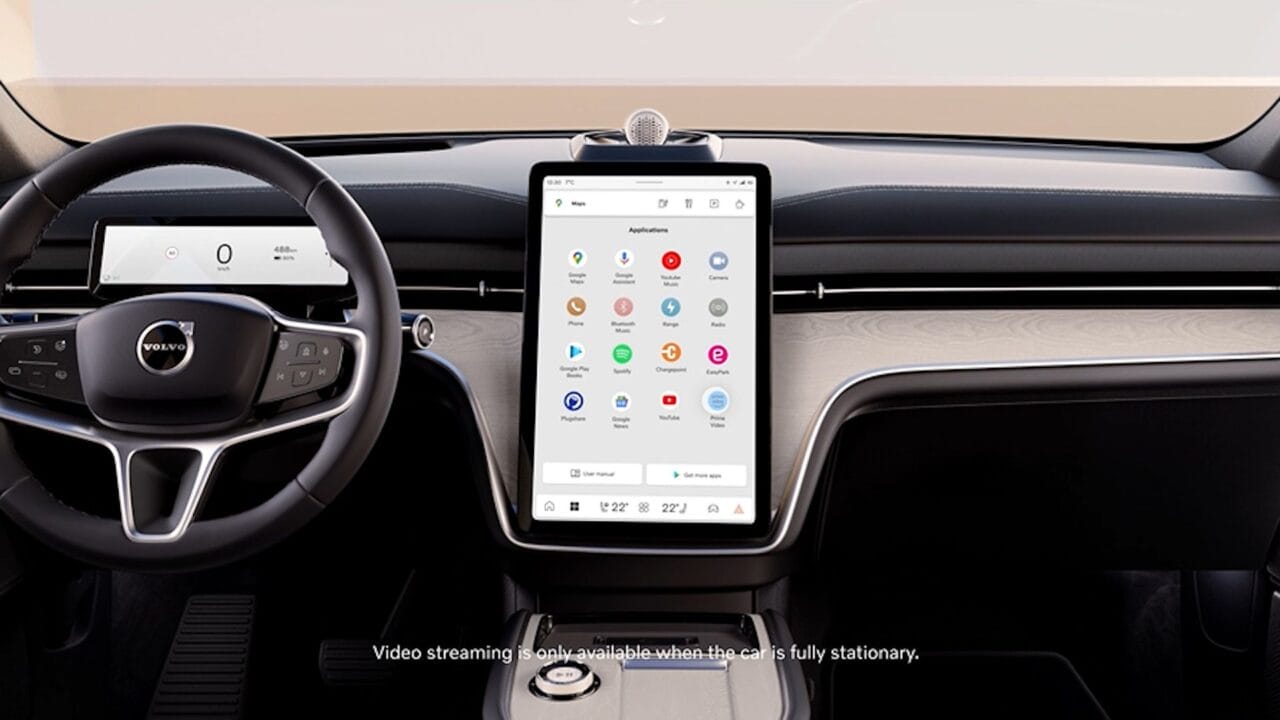
Now You Can Enjoy Google Maps with a Redesigned Interface and More Vibrant Colors on Android Auto, Enhancing Usability Even Further. Try It Now!
The update brings a uniform look to Google Maps across all platforms it operates on. Now, the new design is available for iPhones, Android devices, and also in the web version of the app.
The launch of the change was made discreetly, with little publicity. Although it’s possible to associate the visual update with the ‘Material You’ concept and the arrival of Android 14, Google chose to implement the color changes gradually and quietly, which ended up resulting in negative feedback from users.
The signage and visual elements continue in shades of green, but now feature a softer color palette, with a greater focus on information about distance and routes to be taken. Once again, it’s important to maintain emphasis since we are dealing with an automotive system where information is displayed on larger screens while interaction with the driver is limited.
-
Does a Flag on Your Car’s Hood Overheat the Engine? Expert Reveals the Overlooked Danger for Drivers

-
How to Identify and Remove Superficial Scratches Before Spending on Car Bodywork

-
Electric Car with Extended Range: Company Patents Hybrid Transmission System Using Gasoline Engine for Backup
-
GM Developed the Chevette to Rival the Beetle, Launched it in Brazil Before Europe, Sold 1.6 Million Units, and Left a Generation with Gas Station Trauma


In this context, navigation lines are now presented in a deeper shade of blue, along with small additional details like a speed indicator. However, the side menu, which contains options related to preferences, audio, and navigation, remains unchanged.
Visual Update for Android Auto with Google Maps
The Android Auto system underwent a visual update of Google Maps this weekend, resulting in a modification of the app’s color palette. In addition to being available on the web versions and smartphones, the new feature now extends to connected car dashboards.
With the goal of improving usability, the update opted for softer and cooler tones instead of the saturated and contrasting colors present in the old format. For example, streets and roads now feature gray tones and a greater highlight compared to the lighter blocks, while seas and forests received more subtle touches. **These changes aim to enhance the user experience while navigating the app, providing a more realistic representation of the surrounding environment**.
Source: Canal Tech