





 Portuguese
  Spanish


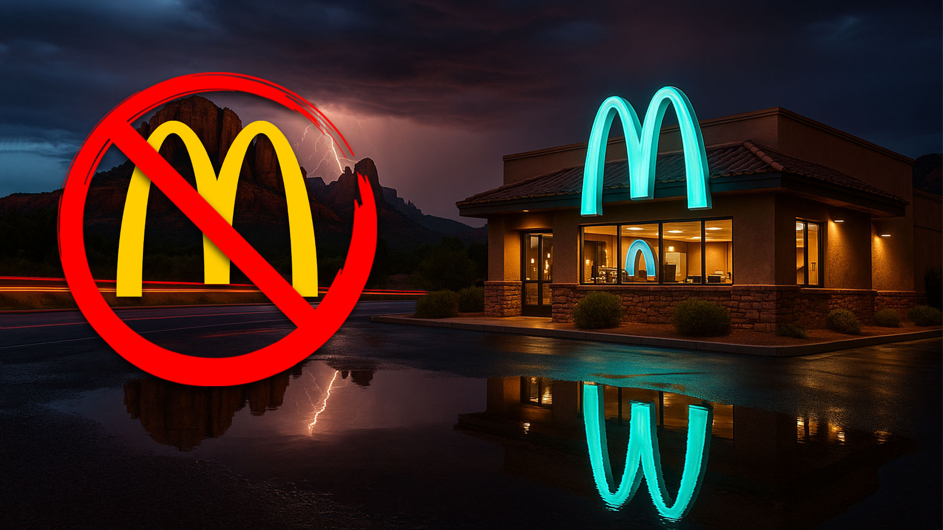

In Sedona, The Chain Had to Abandon the Golden Arches and Adopt a Turquoise M to Comply with Local Color and Landscape Regulations. Understand the Decision and See Where It Is.
The famous global brand McDonald’s almost always appears in red and yellow. In Sedona, a city in Arizona, the facade is different: the M is turquoise. The case dates back to the early 1990s when the restaurant was approved with city requirements to harmonize with the surroundings. The alternative color became a local postcard.
The city hall of Sedona itself uses the example on its official page about “community character,” stating that the city adopts signage standards and that there are the only turquoise arches of the chain in the world. The message reinforces that the local urban design prioritizes materials and colors that integrate with the landscape.
The color change did not alter the rest of the restaurant. According to a report from ABC15, inside it operates like any McDonald’s, but the turquoise arches attract visitors for photos and curious passersby along State Route 89A.
-
Ferrari, BMW, Tesla, and Chinese Automakers Shift from Copper to Aluminum Wiring to Reduce Weight and Costs in Electric Vehicles

-
Understanding Plastic Codes: Numbers 1 to 7 on Packaging Aid Efficient Recycling and Boost Circular Economy

-
400 km² of Greenhouses in Almería, Spain, Astonish American Visitor by Producing Millions of Tons of Produce for Cold-Weather Markets
-
Antarctic Volcano Emits Microscopic Gold Particles That Travel Up to 1,000 Kilometers Across the Continent




What The Sedona Zoning Code Says About Color and Signs
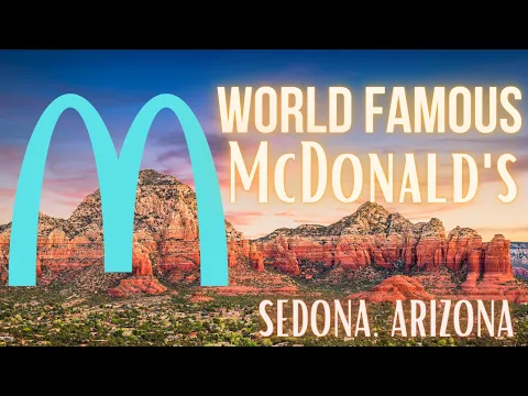

Sedona adopts a Land Development Code (LDC), a set of guidelines that directs architecture, colors, and signage. The official site explains that the sign rules include standards for appropriate colors and integration with natural materials, to preserve the “image and identity” of the area. In simple terms, nothing that shouts louder than the landscape itself.
In the same reference, the city makes it clear that signage must consider colors, materials, and positioning. That’s why bright yellow, typical of McDonald’s, gave way to turquoise, a more discreet shade against the reddish rocks.
This type of guideline is not isolated. Sedona also values the night sky and is listed as an International Dark Sky Community. The set of policies on landscape, lighting, and colors helps to reduce the visual impact of brands and buildings.
Is It The Only One In The World? What Is True And What Is Not
It is correct to say that Sedona has the only McDonald’s with turquoise arches. The city hall itself records this uniqueness. It is not correct to state that it is the only restaurant of the chain without yellow, because there are occasional variations in other places, such as white arches in Paris. The difference here is the chosen color and the urban planning reason.
The local narrative also highlights that the turquoise option was agreed upon with the city when the unit opened in the 1990s, to “fit” into the visual identity that Sedona decided to adopt at the time. The result became a tourist attraction in the city.
For the Brazilian audience, the comparison helps: think of municipal regulations that standardize facades in historical or coastal areas. In Sedona, the aesthetic guidelines apply to the entire urban fabric, including global chains.
Where It Is, How To See, And What To Know Before The Visit
The unit is located at 2380 W US Hwy 89A, Sedona, AZ, the official address of the chain. For those driving through Arizona, the store is visible along US-89A and often sees traffic from those stopping to photograph the turquoise sign.
The interior follows the standard menu and operation. The uniqueness lies in the external color of the logo and in the design of the facade, crafted to engage with the earthy tones of the city.
If the idea is to take a photo, do so with safety, respecting car access, pedestrian paths, and the areas surrounding the drive-thru. Practical information, but necessary in a place that has gained tourist appeal.
Do you think that the city is right to impose color and design on global brands or does this limit the identity of companies and commercial freedom? Leave your comment below and let us know if you would visit the turquoise-arched McDonald’s or prefer the traditional golden arches.




Great article, thank you for sharing these insights! I’ve tested many methods for building backlinks, and what really worked for me was using AI-powered automation. With us, we can scale link building in a safe and efficient way. It’s amazing to see how much time this saves compared to manual outreach.
I must say this article is extremely well written, insightful, and packed with valuable knowledge that shows the author’s deep expertise on the subject, and I truly appreciate the time and effort that has gone into creating such high-quality content because it is not only helpful but also inspiring for readers like me who are always looking for trustworthy resources online. Keep up the good work and write more. i am a follower.