


 Portuguese
  Spanish




Discover The Mystery Behind Ford’s Iconic Logo And Find Out If The Letter “F” Really Has An Extra Curve That Intrigues The Brand’s Fans.
The iconic Ford logo, recognized worldwide, hides a curious detail that has gone unnoticed by many drivers. The brand, founded in 1903 by Henry Ford, is currently the sixth largest automaker in the world and the second largest in the United States.
Its blue and white emblem is easily identified by millions of people around the world, but a small element in the design has sparked discussions on social media.
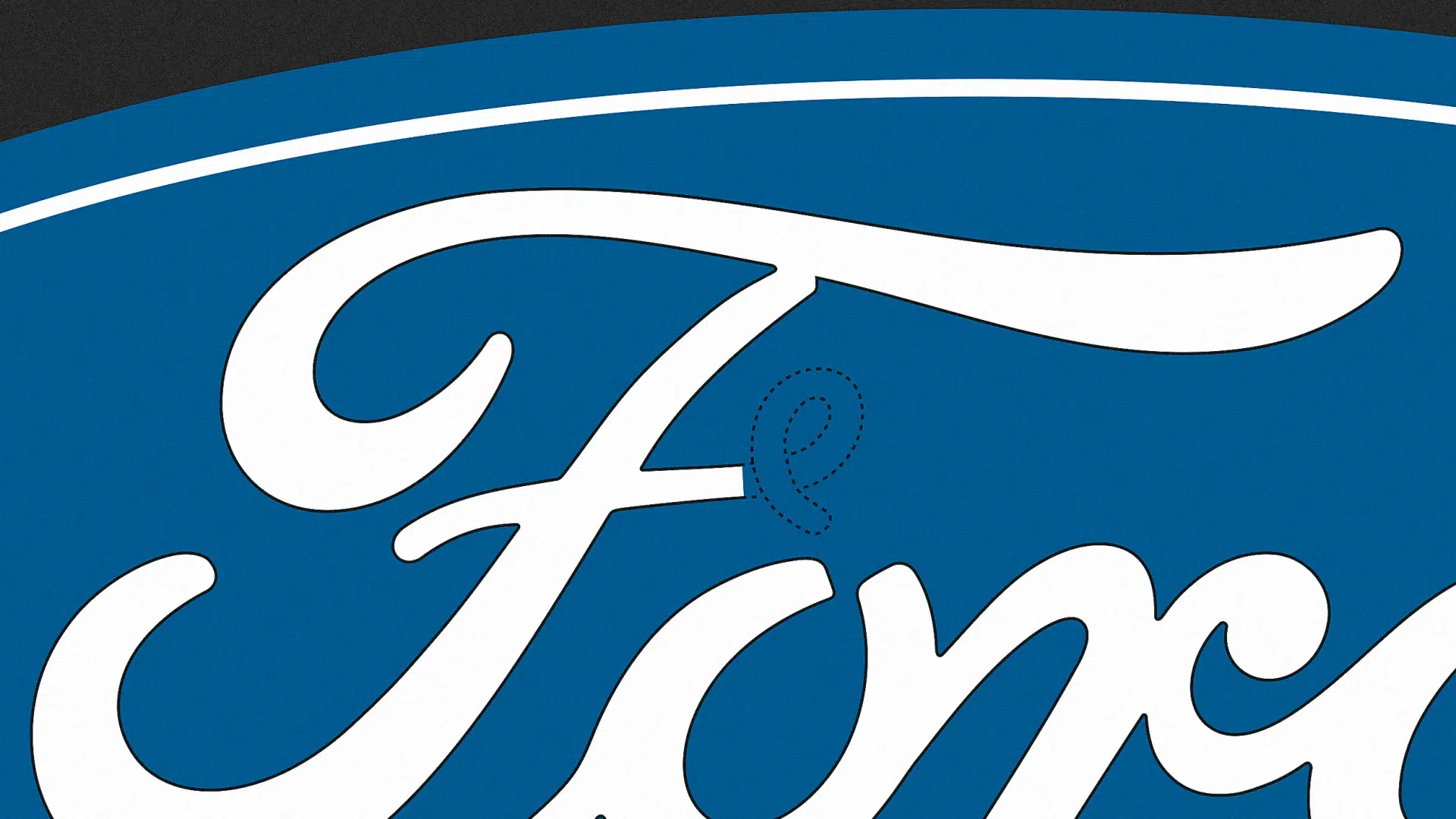
The Ford symbol features a dark blue oval with the company’s name in white cursive letters. Although it seems simple, attention has turned to a specific characteristic of the letter “F”.
-
End of an era in Brazil: beloved sedan by Brazilians is discontinued despite having a 2.0 engine with 151 hp, CVT transmission, 466-liter trunk, and up to 650 km of range.

-
New Law Proposal in Brazil Could Heavily Penalize Drivers: Dangerous Overtaking May Become a Serious Offense with Fines Increased Tenfold and a 12-Month License Suspension; Update on 2026 Progress

-
Electric Revolution: Watts W125 Motorcycle Offers 160 km Range, 90 km/h Speed, and Affordable Price Starting at $3,000
-
General Motors Replaces Over a Thousand Workers with 50 Cobots at Electric Vehicle Plant, UAW Union Criticizes Move Amid Industry’s Automation Push




A video posted on TikTok brought to light a debate about the curvature of the letter’s second stem, sparking the curiosity of many users.
Viral Debate
American Monica Turner, responsible for the post, showed two versions of the Ford logo. In one, the letter “F” has an extra curve, while the other lacks this detail. The question that arose was: which is the true emblem?
Monica expressed her surprise by saying: “This is strange because the more I look at it, the more the two seem wrong.” She continued exploring the issue, highlighting that over time, the Ford logo has undergone changes.
The shape of the oval and the colors have varied between red, black, and different shades of blue. However, according to Monica, the logo itself has always maintained the same basic design.
At a revealing moment in the video, Monica asked the audience which of the two versions they believed to be the genuine one. The response surprised many: the authentic Ford logo has always featured the curve in the “F”.
Public Reactions
The revelation left viewers confused. Several users claimed to be sure that the Ford logo did not have that swirl in the letter F. Confusion spread in the comments, highlighting how this detail had gone unnoticed over the years.
However, a former Ford truck mechanic provided enlightening information. According to him, the official company emblem has always included the swirl in the “F“.
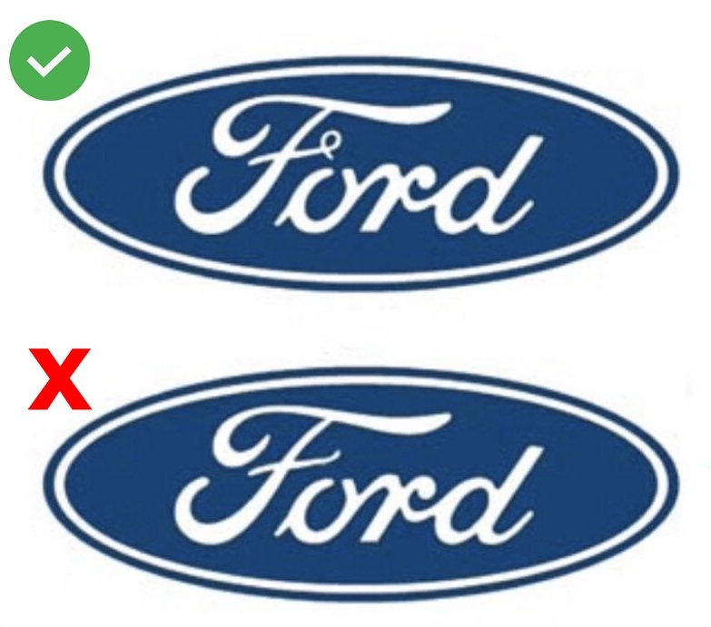
The version without the swirl, on the other hand, is a design without copyright. This alternative version is often found on merchandise like shirts and hats.
Origins of The Logo
The history of the Ford logo dates back to the company’s early years. Initially, the brand used various emblems. In 1909, a design inspired by Henry Ford’s calligraphy was adopted. This model, however, did not feature the curvature in the “F”.
Two years later, in 1911, the logo underwent another revision. This update resulted in a design resembling what we know today. Since then, the logo has maintained its essence, spanning generations and becoming one of the most recognizable in the automotive industry.
The portal Car Logos explained that the typography used in the emblem does not come directly from Henry Ford’s signature. The font was created by Childe Harold Wills, an engineer and designer at Ford Motor Company. Wills worked closely with Henry Ford and adapted the founder’s handwriting to create a distinct font for the logo.
Mystery Surrounding The Curved “F” Of Ford
Although the exact reason for the curvature in the “F” remains unknown, several theories circulate. There are speculations that the detail was designed to resemble a lowercase “e”. This feature would be a tribute to Edsel Ford, son of Henry Ford. Edsel served as president of the company from 1919 until his death in 1943.
Despite the speculation, there is no official confirmation from Ford regarding this hypothesis. What is certain is that the swirl has always been present in the original logo, surprising many who believed otherwise.
The online discussion shows how seemingly simple details can generate great interest. After all, even elements present for over a century can hide unexpected secrets.