Portuguese
  Spanish
The Nickname PRIO, Given by the Stock Exchange Panels to the Oil and Gas Company PetroRio, Becomes the Official Name of the Company in May 2022
The largest independent oil and gas company in Brazil, PetroRio, has a new face and is now called PRIO. Do you know where this name came from? From the acronym of the panels that indicate stocks on the Stock Exchange, specifically from the B3 index. PetroRio has been trading shares since 2020 on the stock exchange, and the company’s new visual identity promises to make it easier for future shareholders and interested parties to identify.
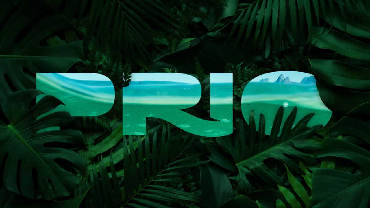
The nickname PRIO is already well-known in the market, even used by its own employees and analysts. Therefore, the unification of the name only served to strengthen the brand and will add even more value. The redesign of the brand was done by the Plau studio in partnership with the Rastro agency. This new visual identity features a new typeface, PRIO Sans, which includes curves representing Rio de Janeiro and straight lines, pointing to seriousness.
Learn a Little More About PetroRio’s History in the Archive in the Video Below
The New Logo of the Brand Brings a Bit of the Culture and Positioning of the Company, as Well as the Beauty of Rio de Janeiro
The new logo of the brand brings various interesting traits that represent the culture, values, and positioning of the company, along with the beauty of Rio de Janeiro, where the company operates. Thus, the company aims to reinforce its successful management model and be more easily remembered during the purchase of PetroRio shares. The constant expansion and pursuit of new wells are also represented.
-
At 14 years old, she worked in a factory in Hong Kong, studied economics abroad, and then entered the Chinese real estate market, which helped change the landscape of Beijing.

-
While NATO secured more than $10 billion in missiles and space surveillance at a single forum, Brazil still spends 1.1% of its GDP on defense and is stalling its own anti-aircraft system.

-
Corn ethanol attracts R$ 23 billion in 21 new plants and prepares for a nearly 50% jump in Brazilian production by 2027, even with high interest rates.
-
A newly opened terminal in the middle of the Amazon has begun transporting soy and corn through Amapá, eyeing the queue of ships that is congesting the ports in the South.


Nelson Queiroz Tanure, one of the presidents of PRIO, states that the company is made of the dreams of its employees and arose from a dream. Therefore, the logo brings a dreamy landscape tone along with the font created by the design team and the nature-inspired lines, as shown in the figure below.
Moreover, the change was necessary to unify the name for the public and make it consistent with the stock acronym, so that it would be easier to recall the name when purchasing PetroRio shares. Therefore, this new visual identity of the company carries enormous symbolism and a new positioning in relation to shareholders and the public in general.
PRIO is the Largest Independent Brazilian Oil and Gas Company and the New Visual Identity of the Company Represents Everything It Stands For
PRIO has been one of the first Brazilian companies to worry about recovery and conservation, to increase the durability of mature fields, and currently, it is the largest national independent in oil and gas production. Seeking to combine new technologies and innovative solutions, the company boasts great efficiency in the extraction of natural resources, due to the optimization of the entire process without losing quality. Additionally, the company always aims to reduce costs through innovative solutions in pursuit of excellence.
Due to the excellent results, the company gained greater visibility starting in 2020, entering the B3 index of the Brazilian Stock Exchange, one of the most important. Thus, the brand management team felt the need to create a new visual identity for the company, as it became even more sought after by shareholders. The concern to bring a human-focused approach and values to society resulted in a logo that is unique and striking, conveying to people everything that PRIO represents in the national scenario.